Linen Color Guide
Choose a Color Palette by Mood!
Select from the options below to view palettes.
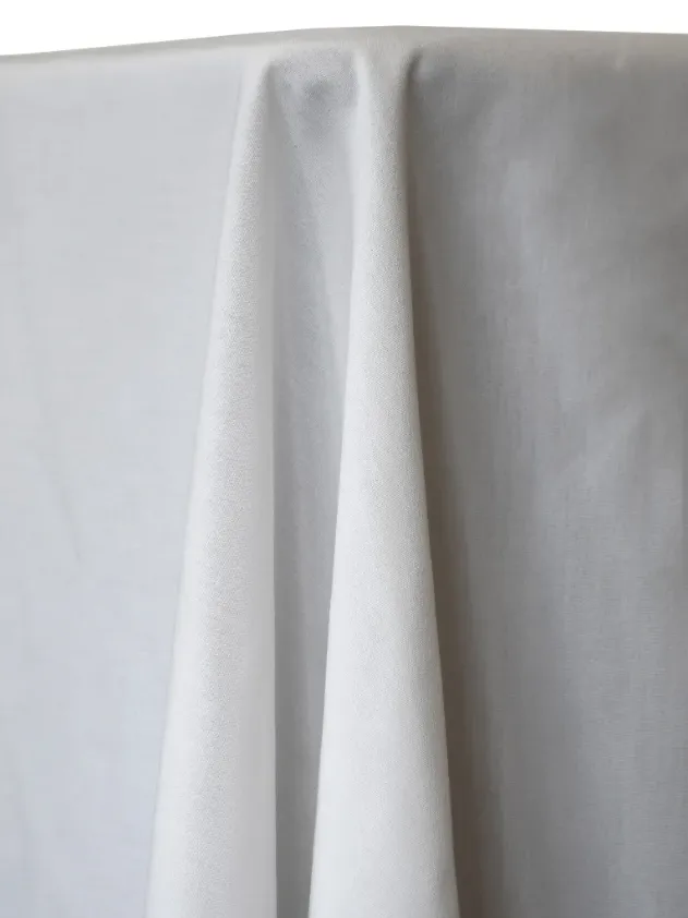
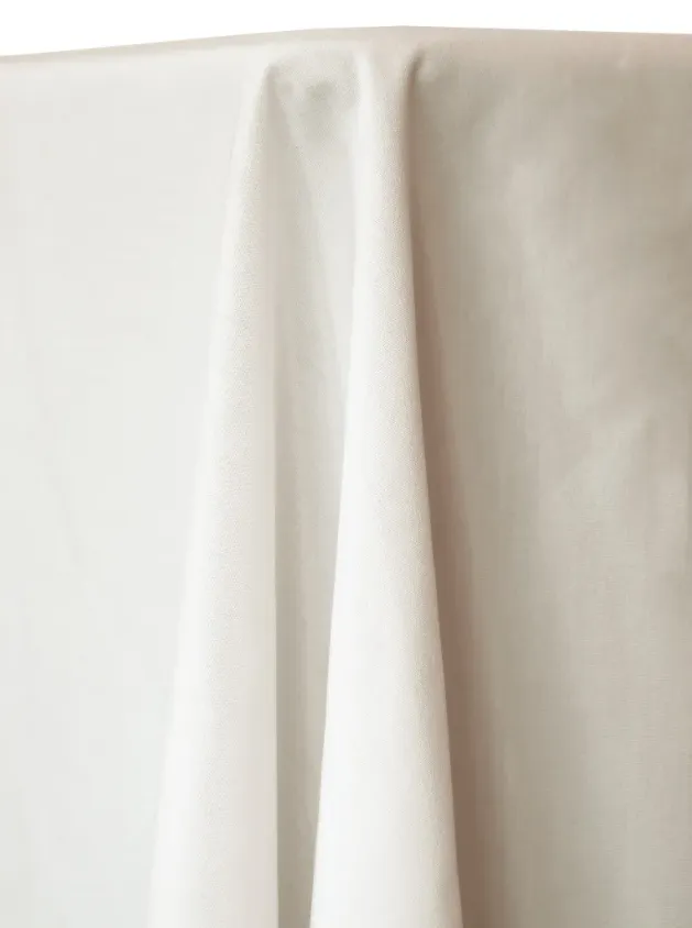
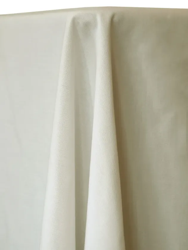
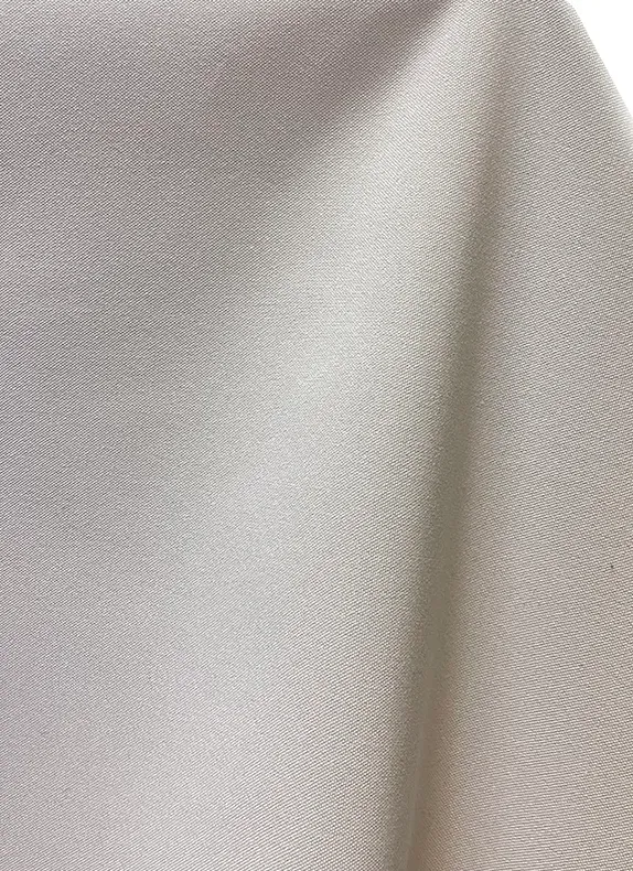
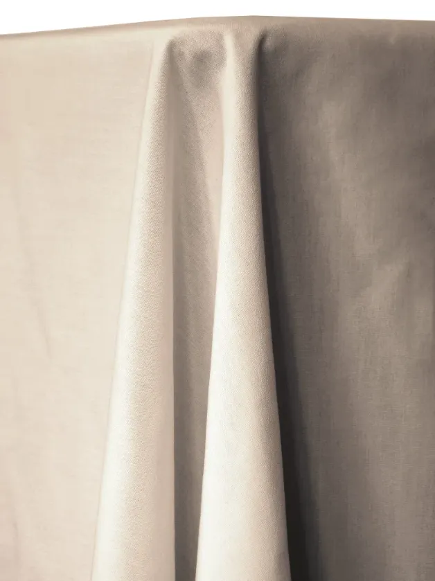
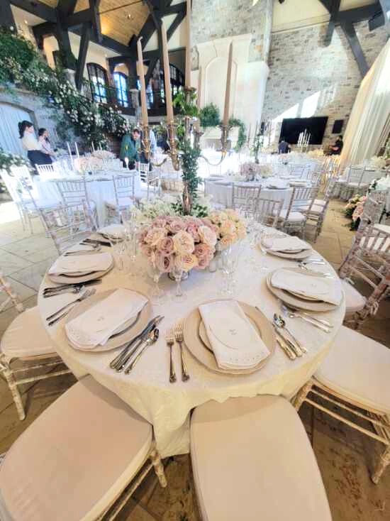
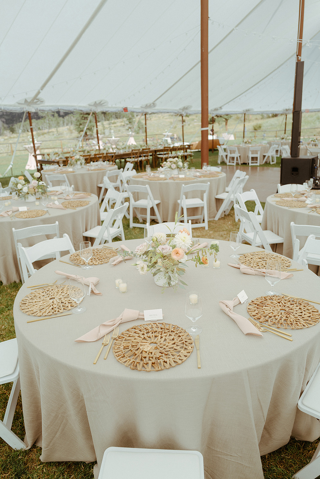
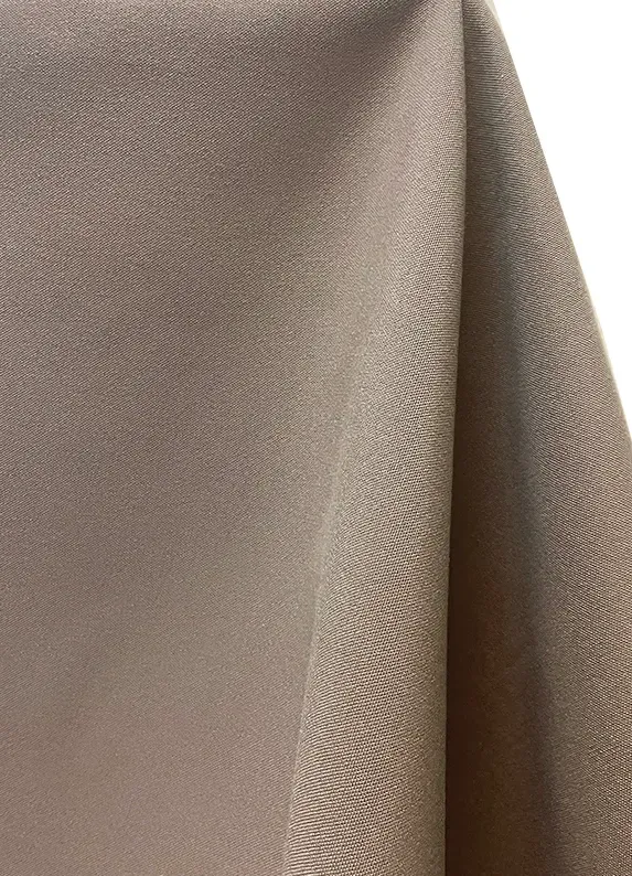
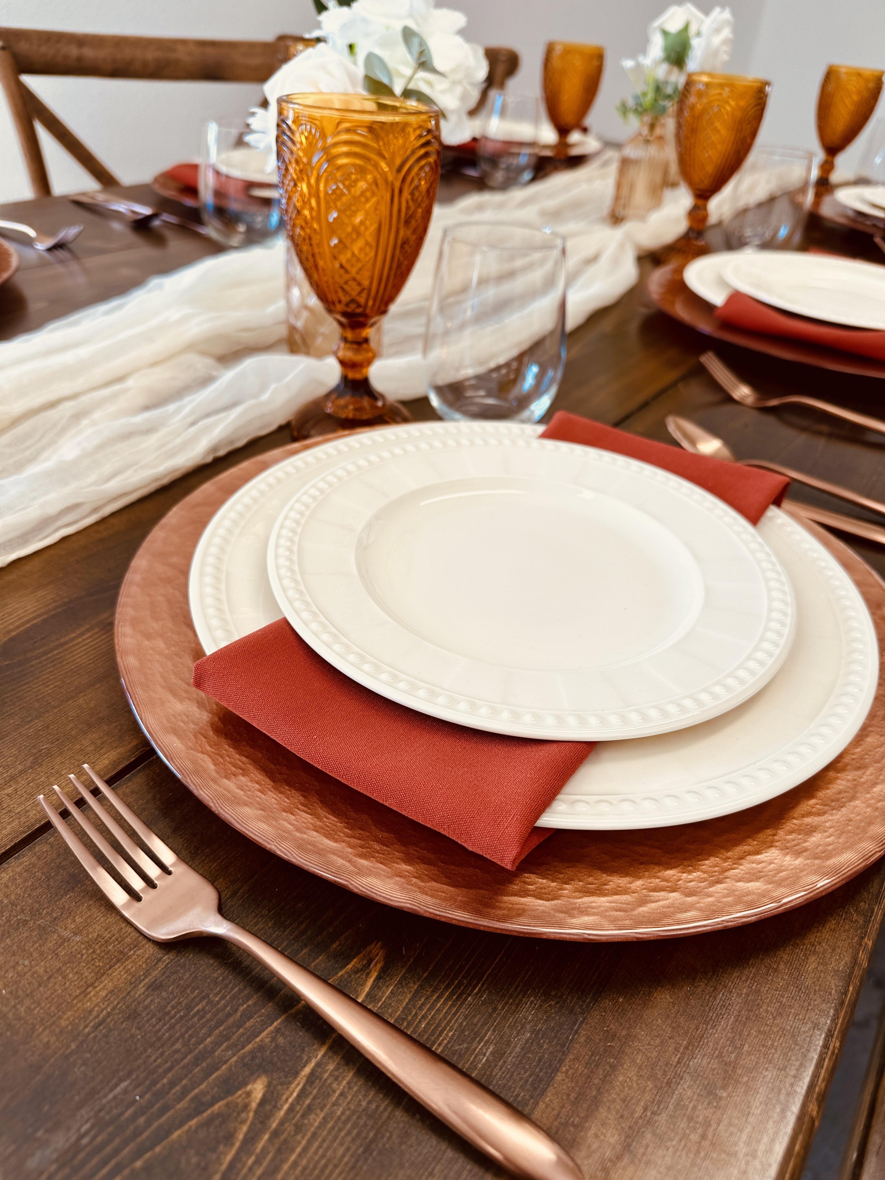
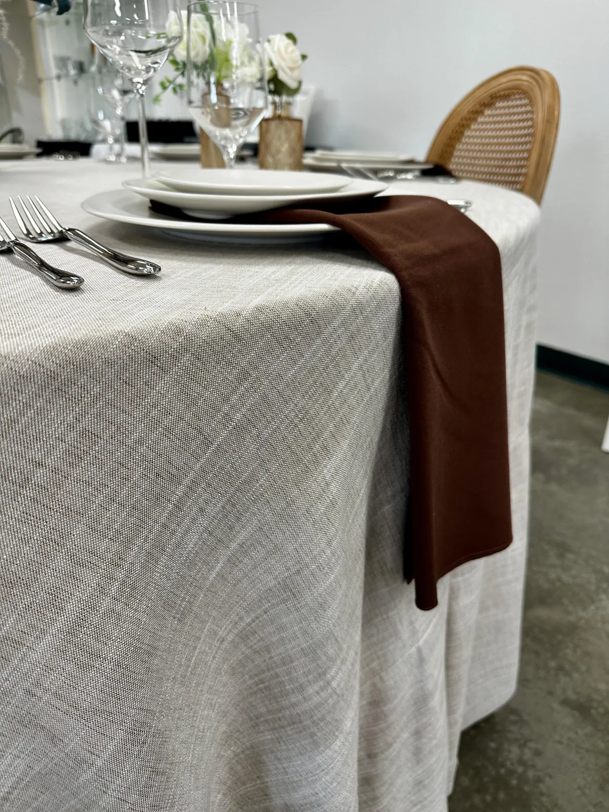
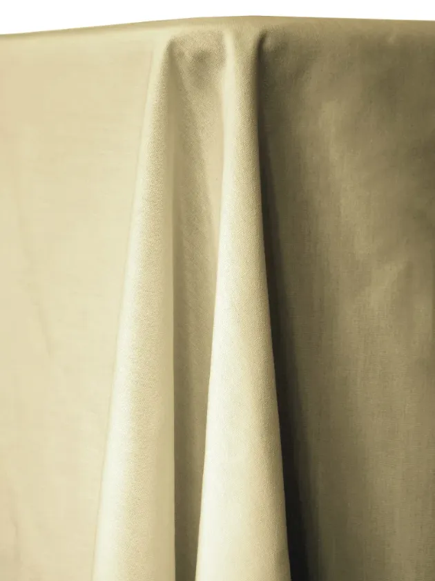
Soft Neutrals
Timeless, warm, and effortlessly elegant. These linens blend beautifully with florals, candlelight, and nearly any venue style.
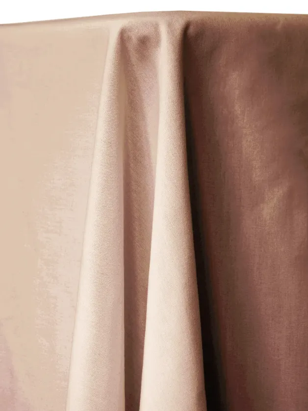
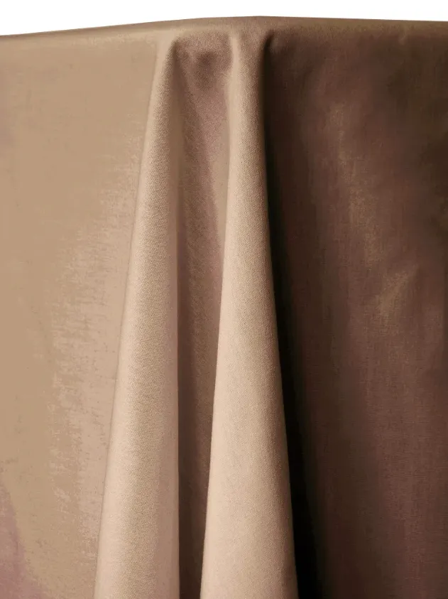


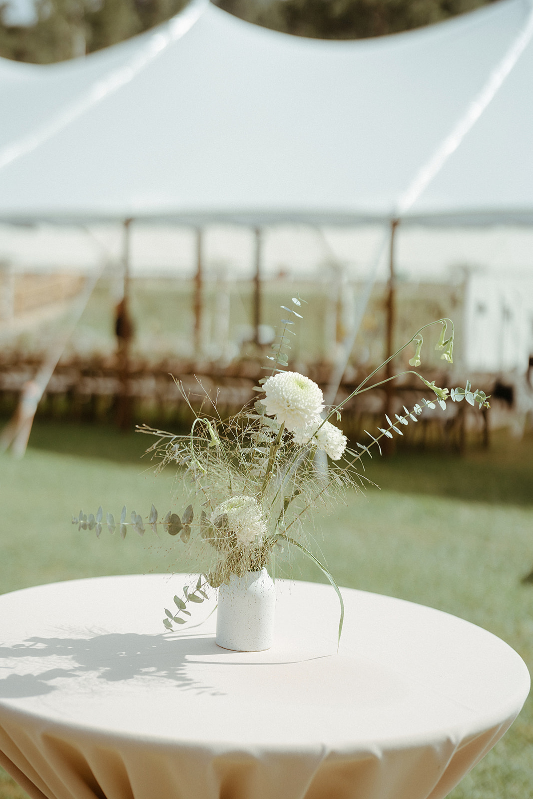
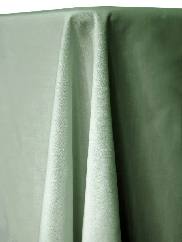
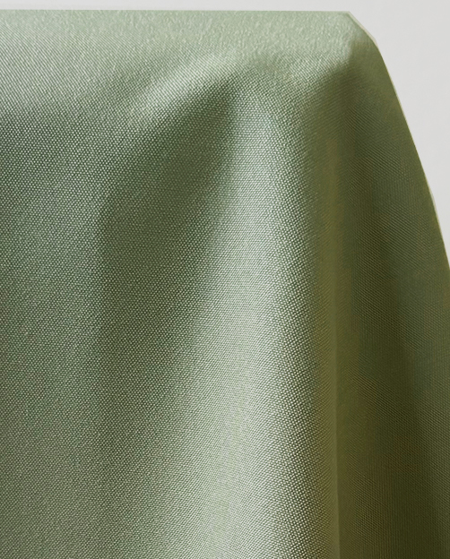
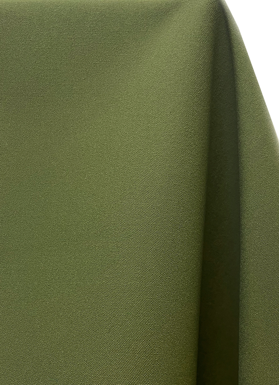
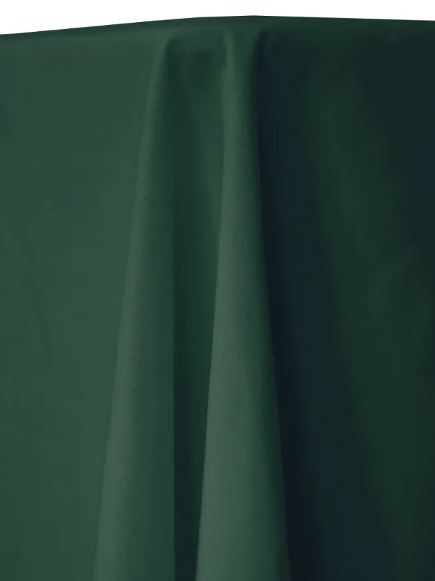
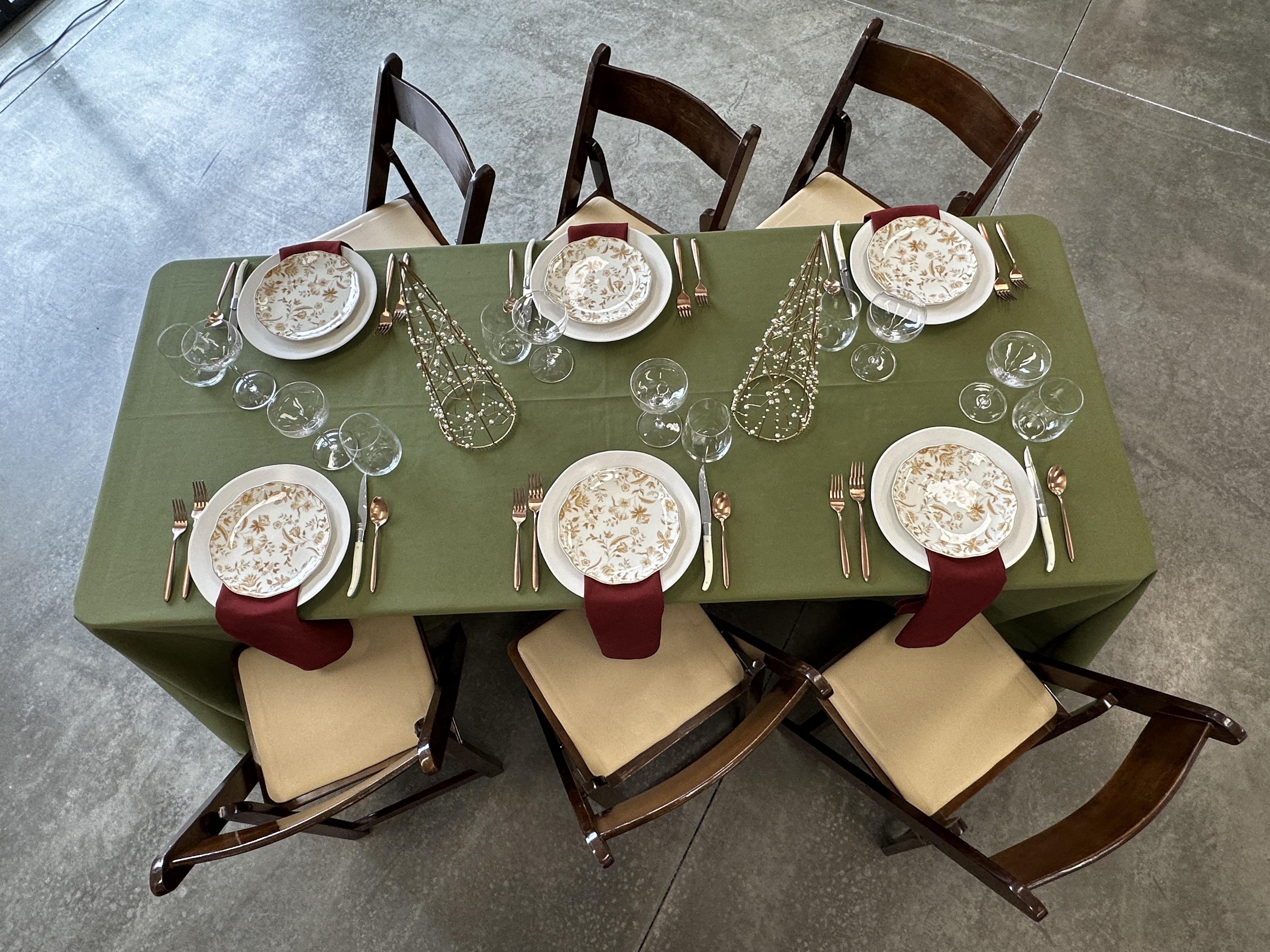
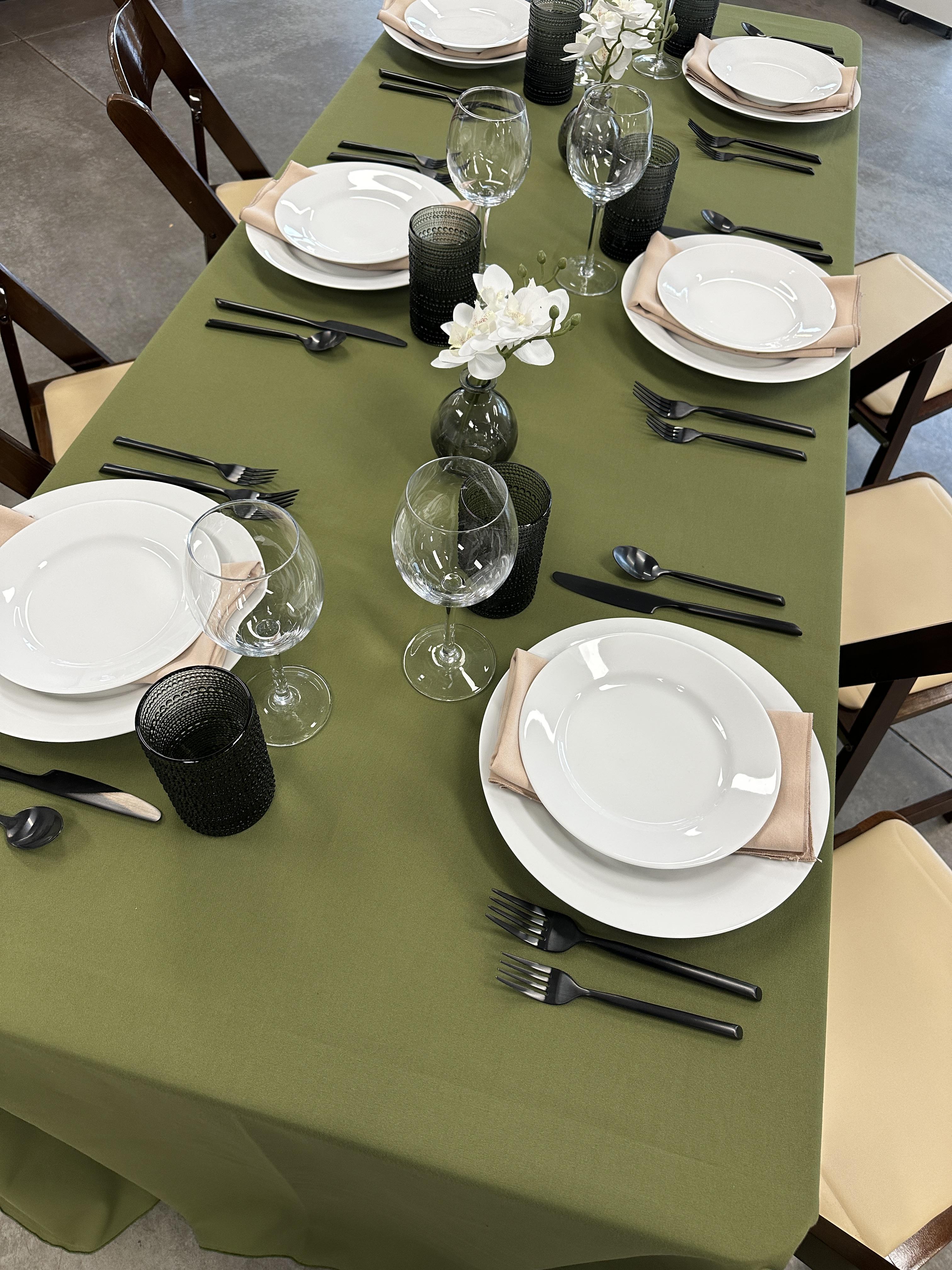
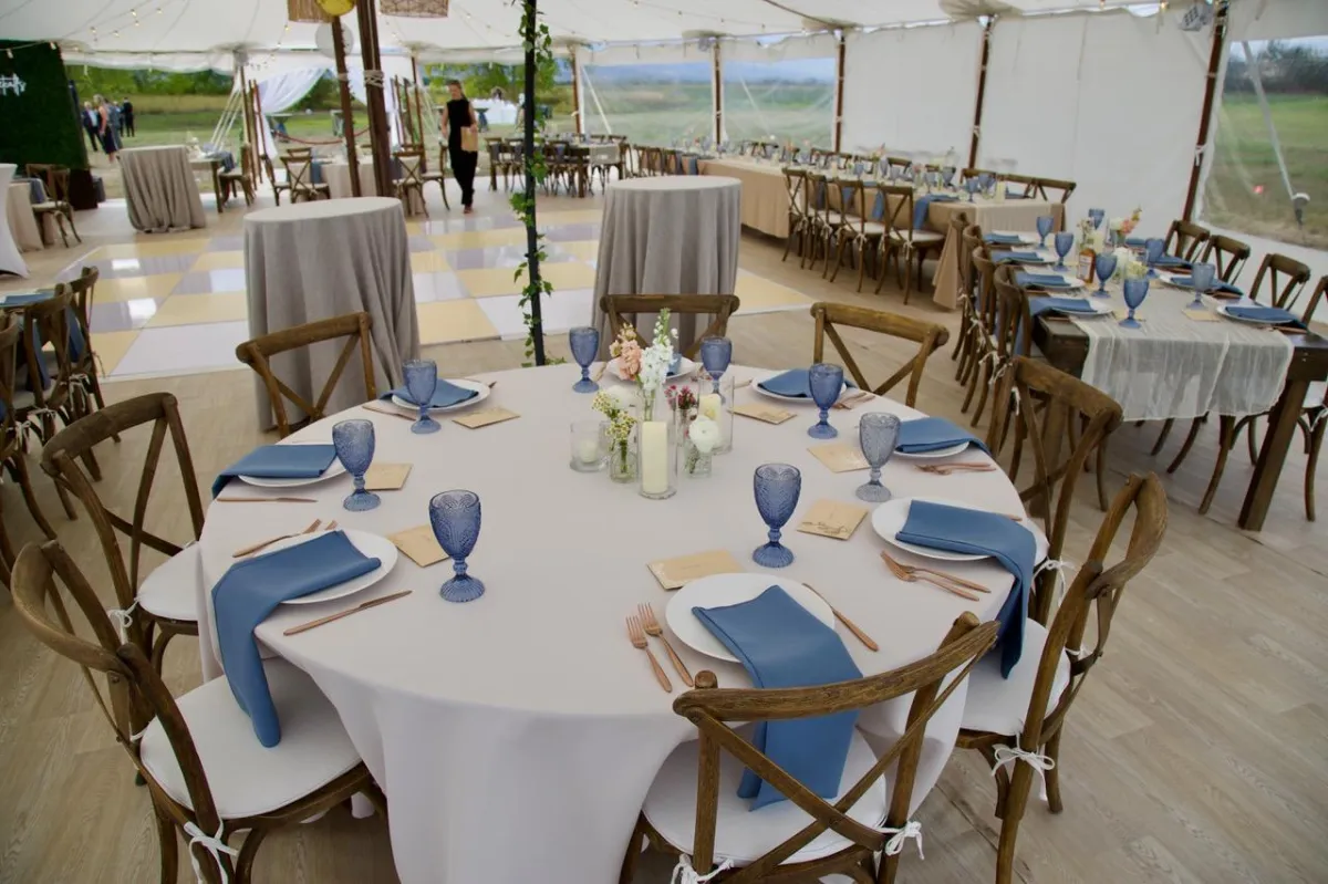
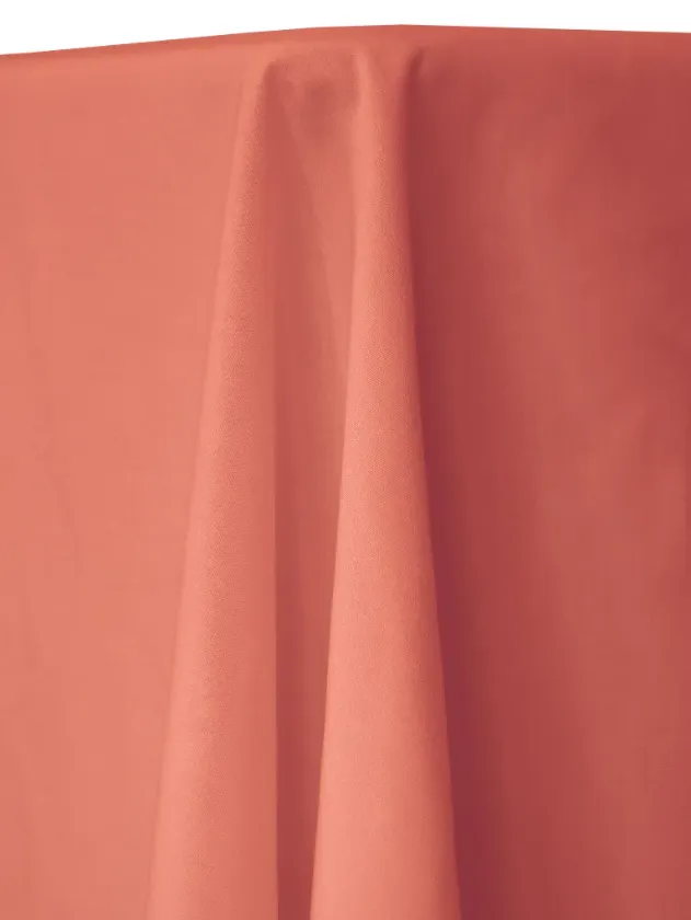
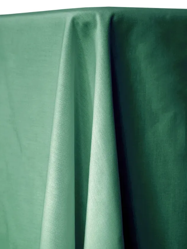
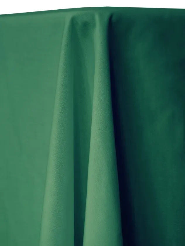
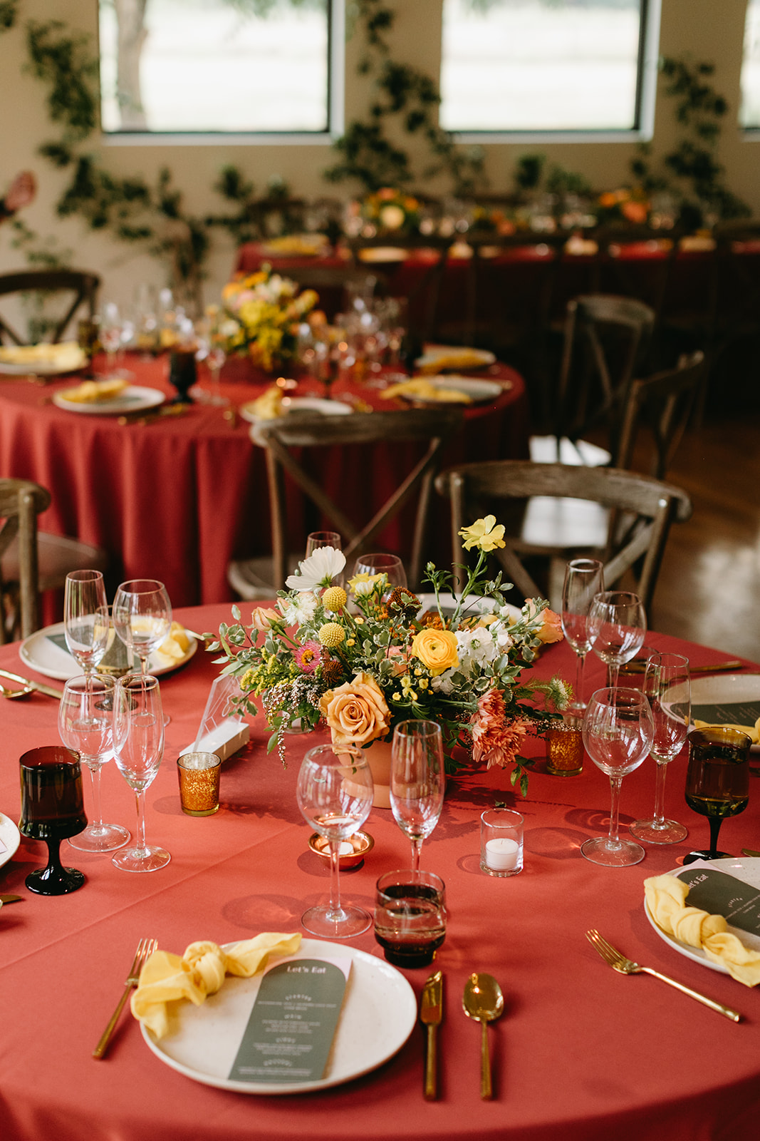
Earthy & Organic
Grounded and natural with an organic feel. Ideal for venues with wood tones, greenery, and an indoor-outdoor aesthetic.
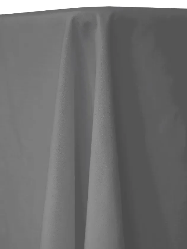
Modern Monochrome
Clean, architectural, and design-forward. These linens create contrast and structure for a polished, modern look.

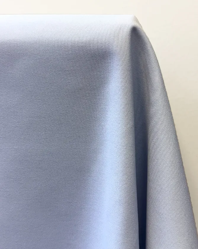
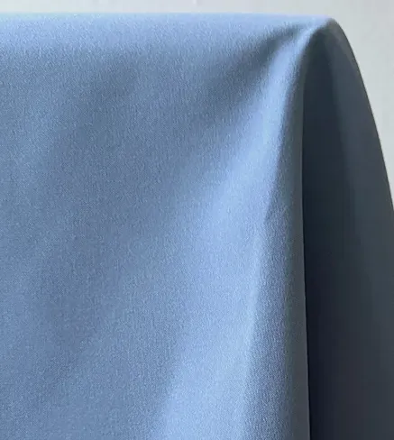
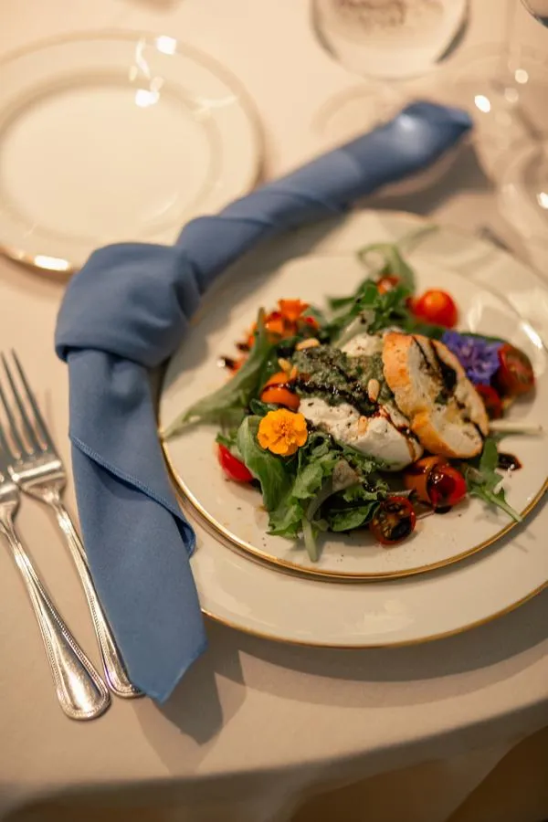
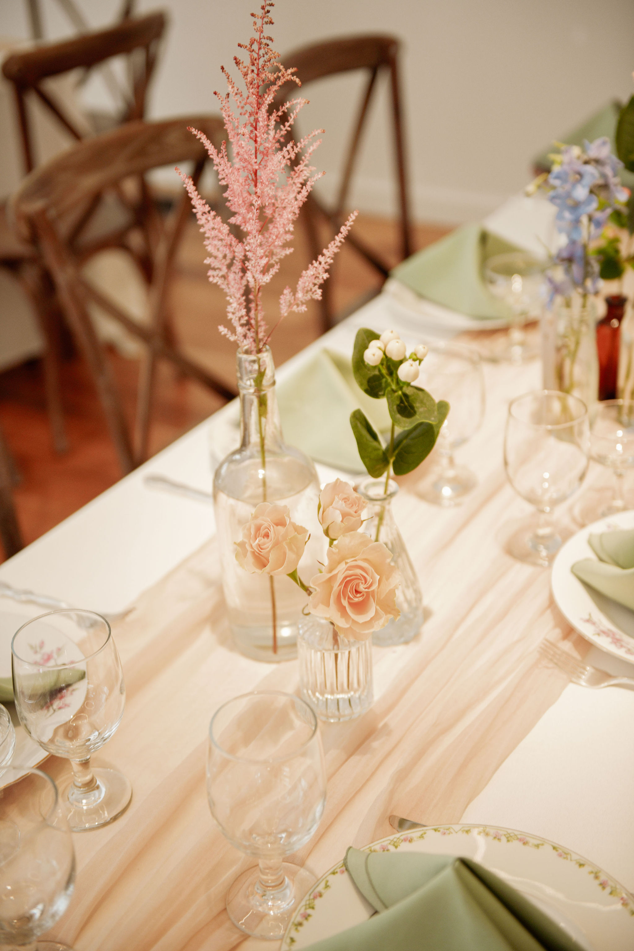
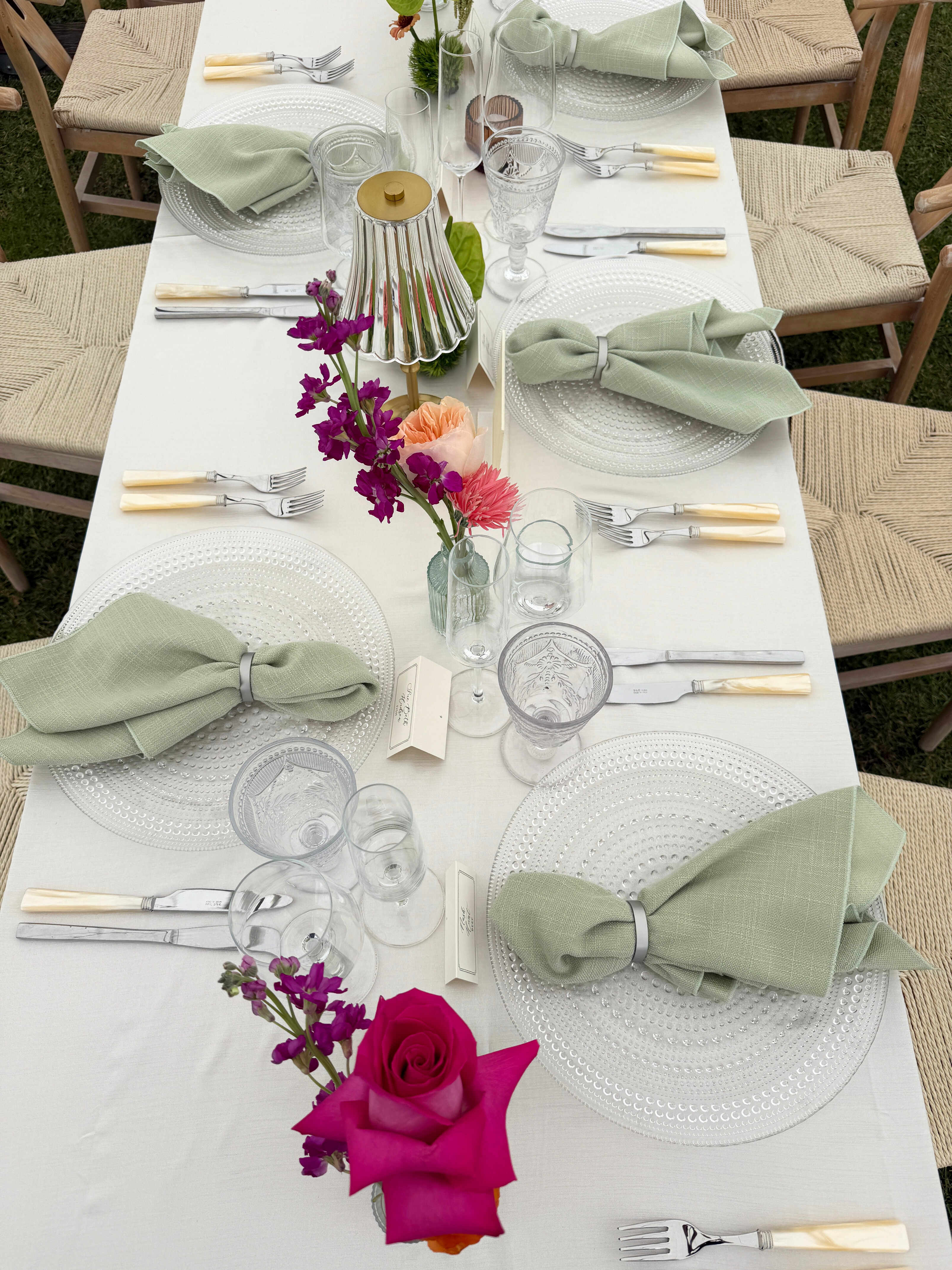
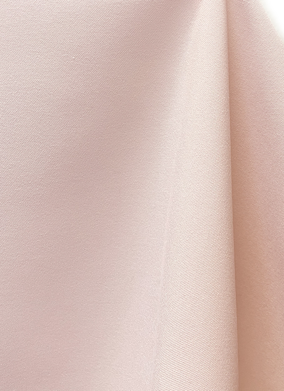
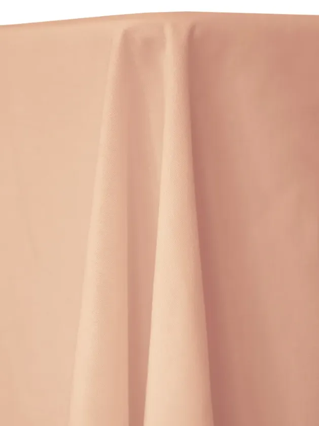
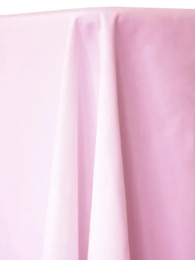
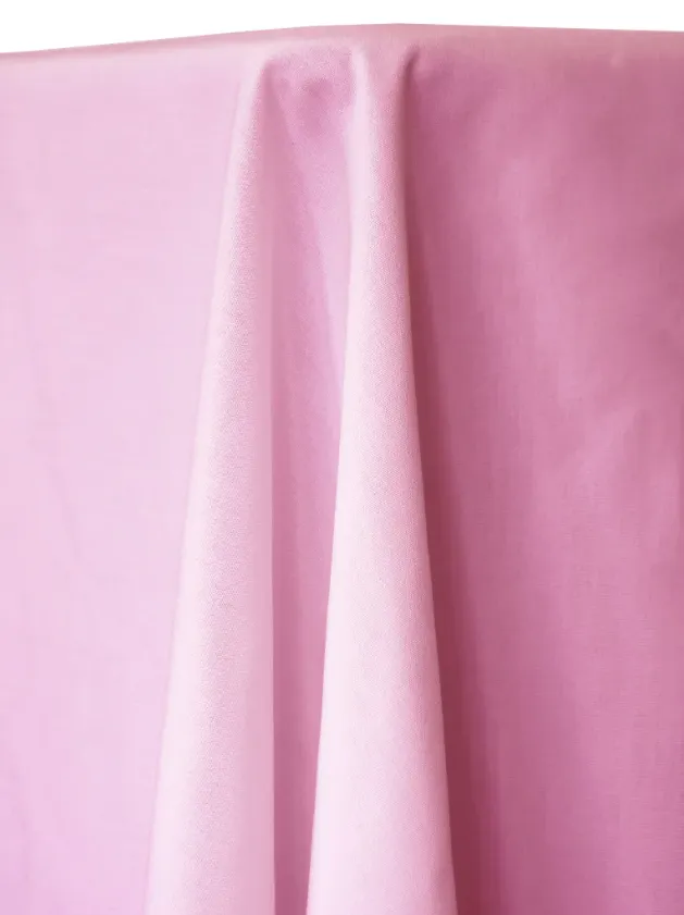
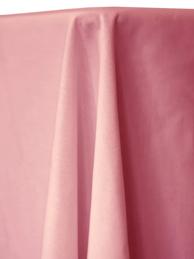
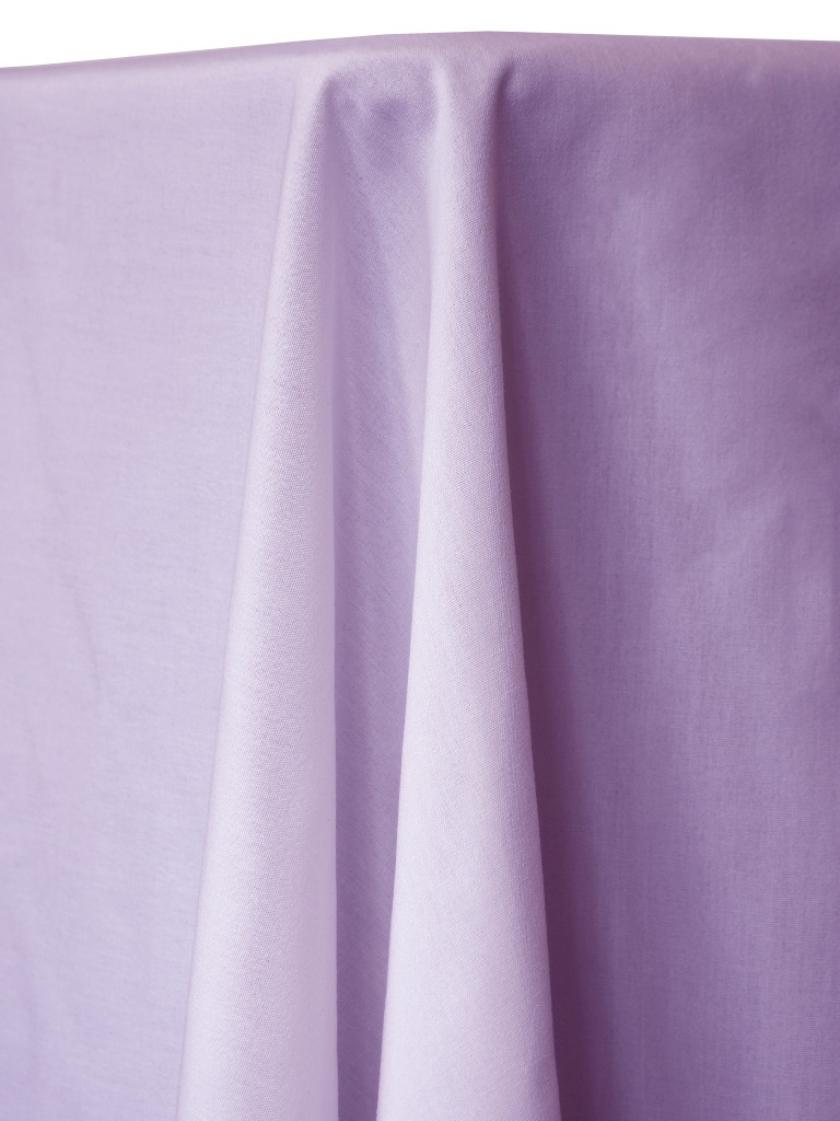
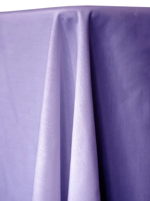
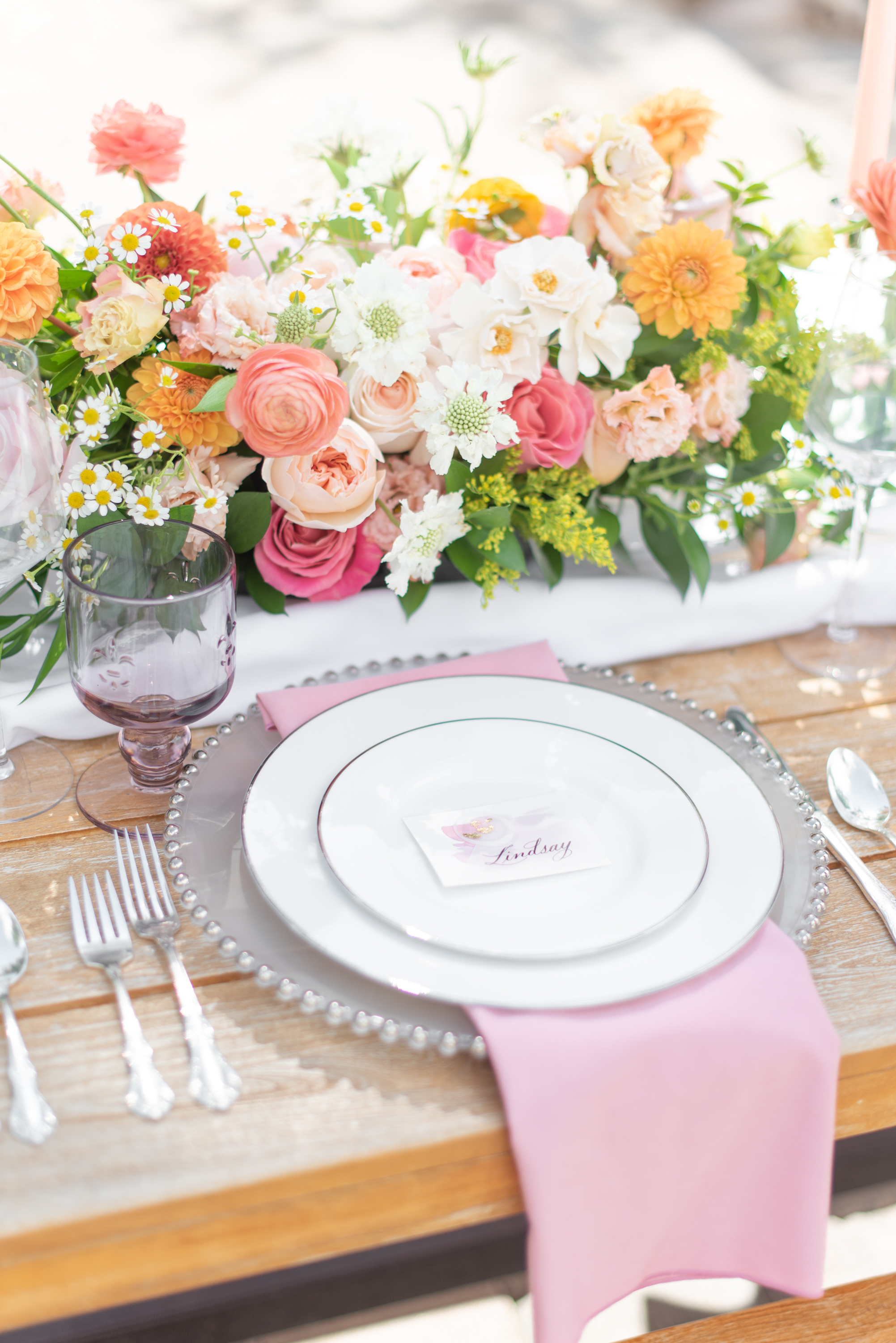
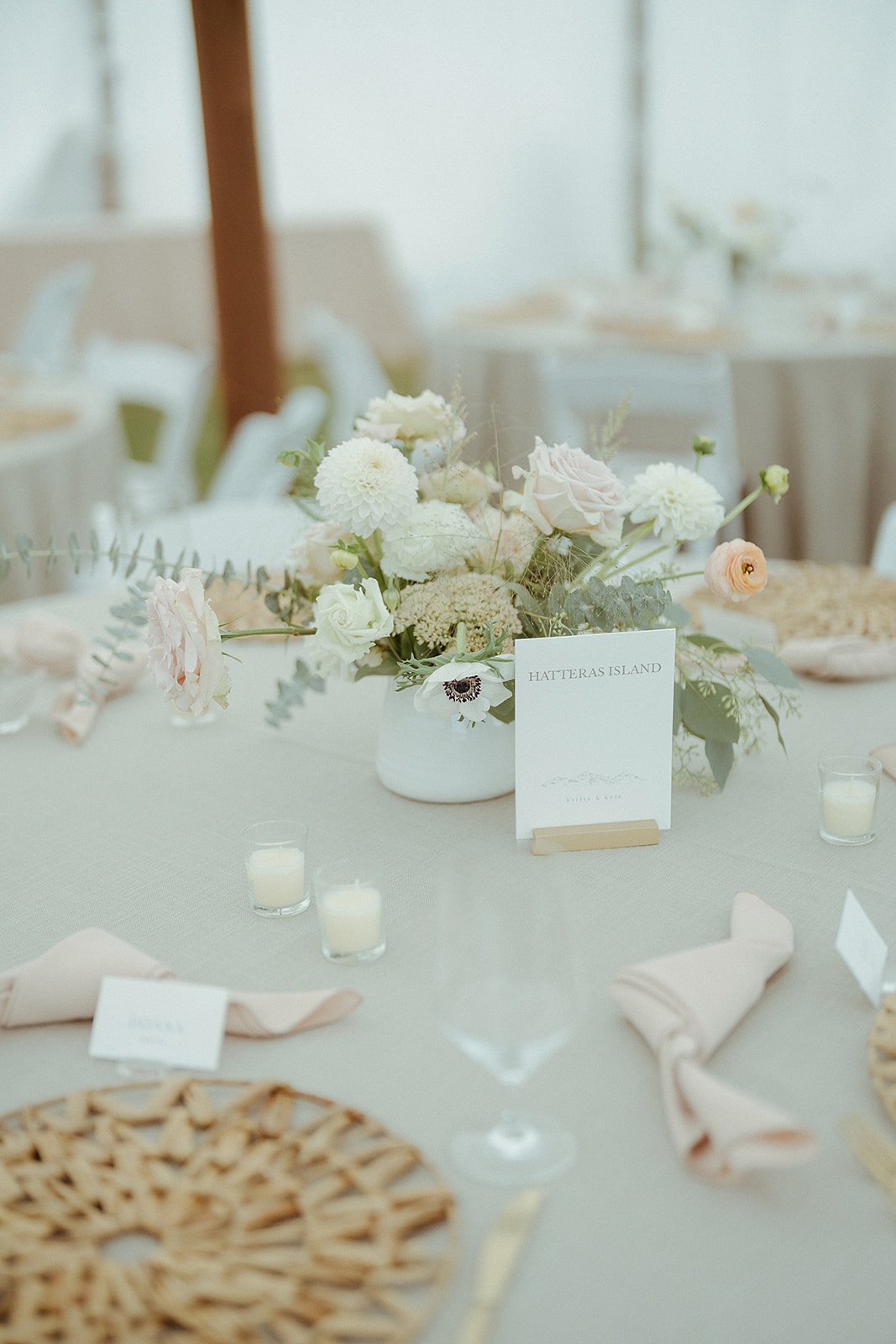
Romantic Pastels
Soft, airy, and romantic. Perfect for weddings and celebrations that call for a light, delicate color palette.
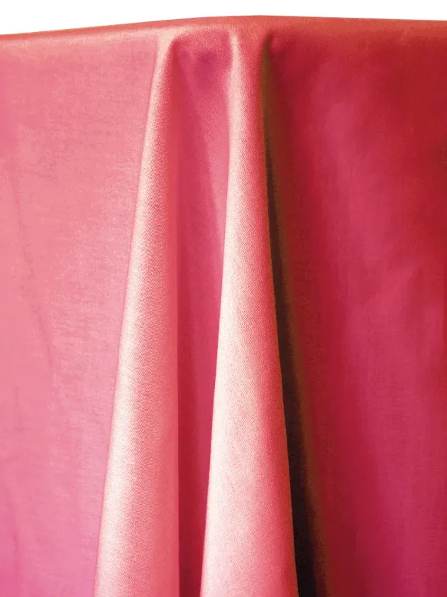

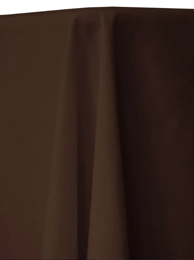
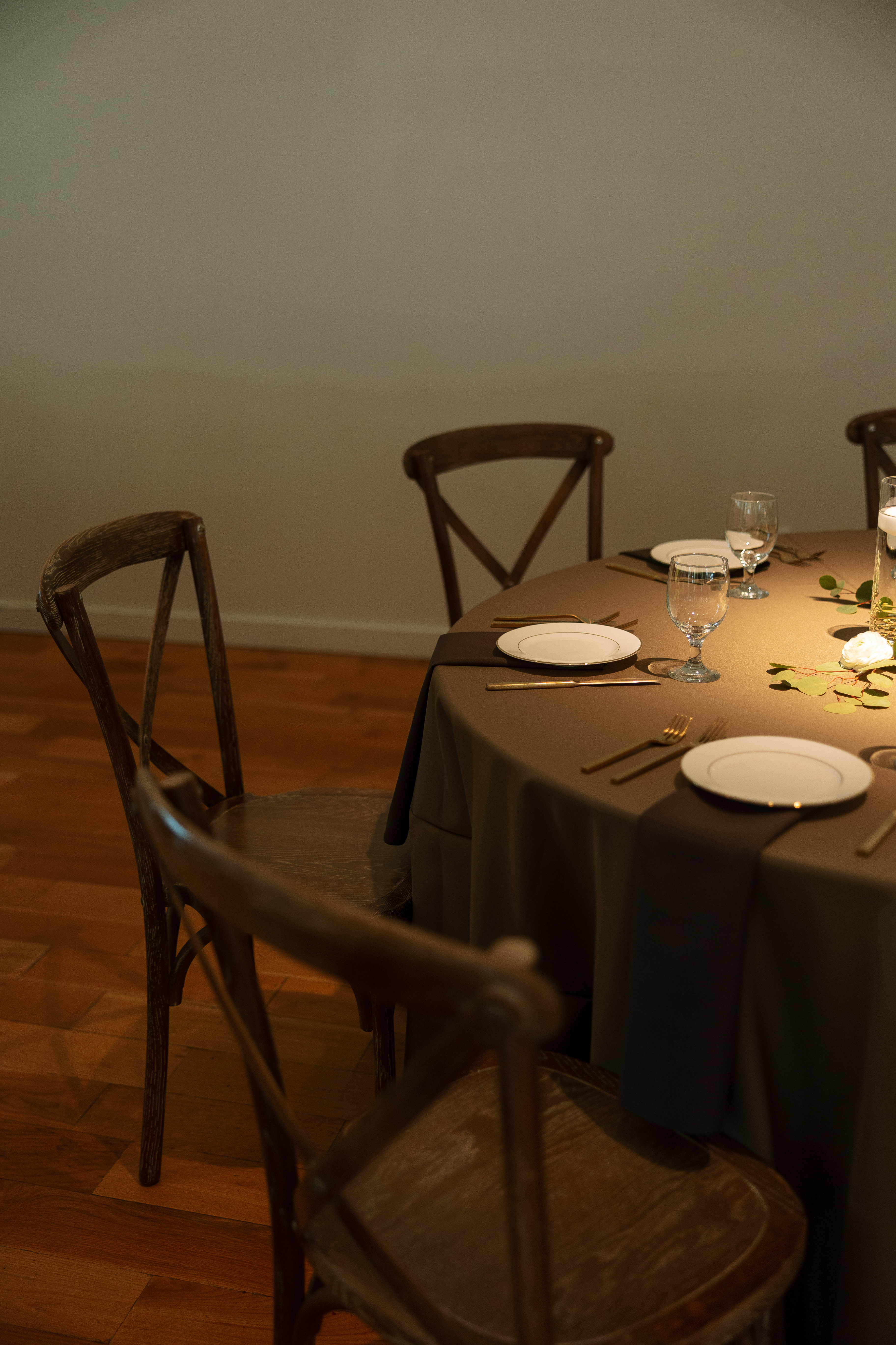
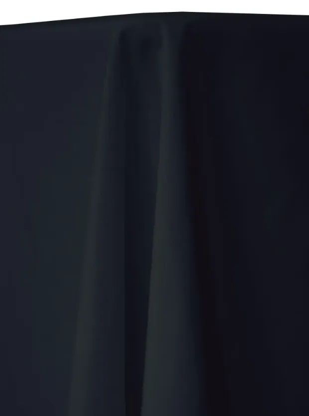
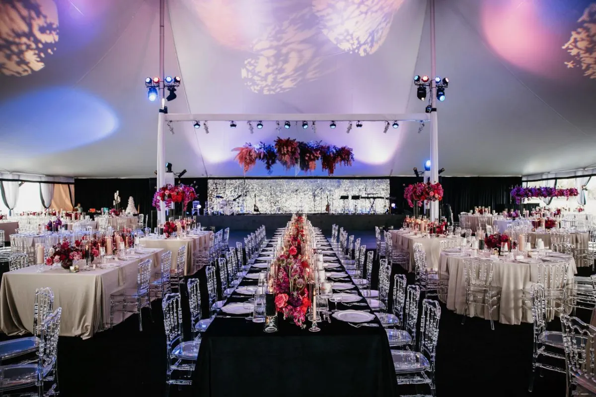
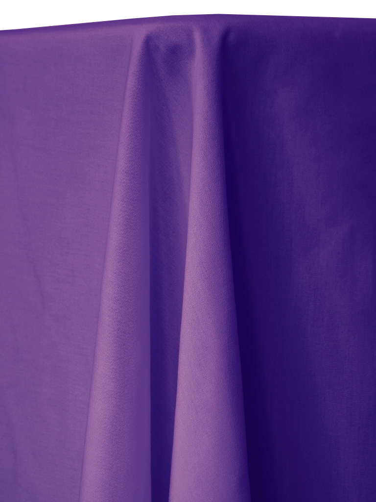
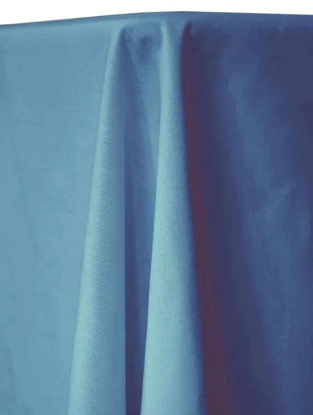
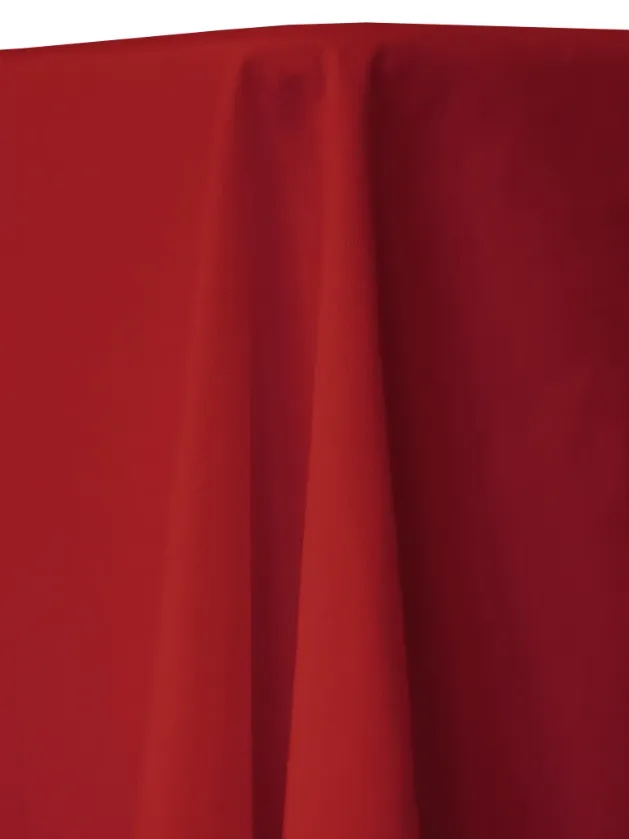
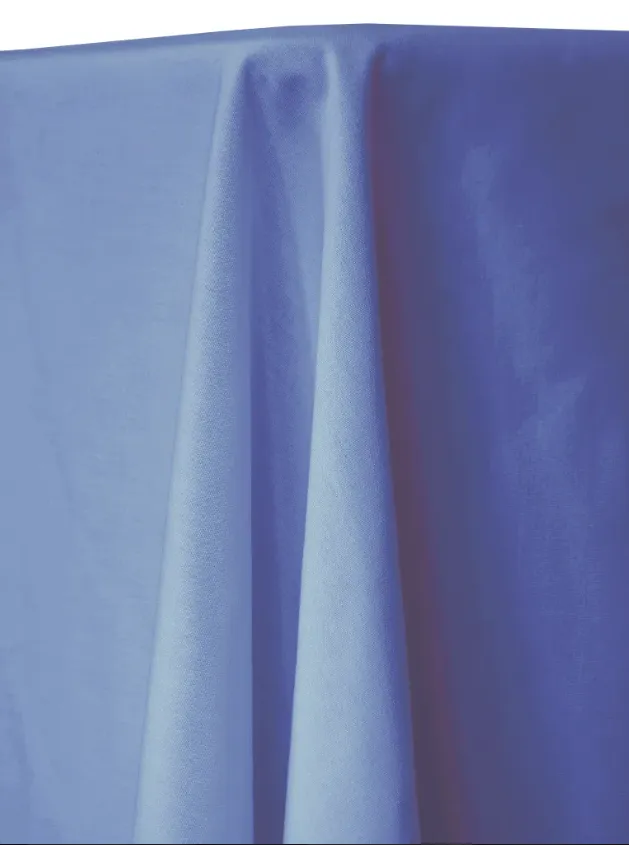
Bold & Moody
Rich, dramatic, and full of personality. Best for statement designs, evening events, and clients who want impact.
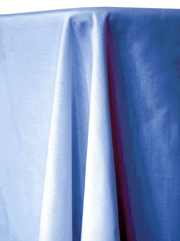
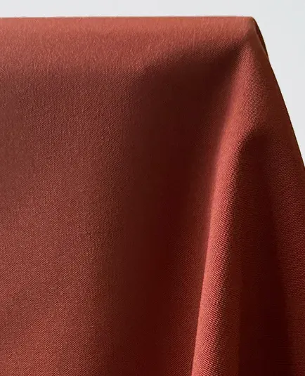
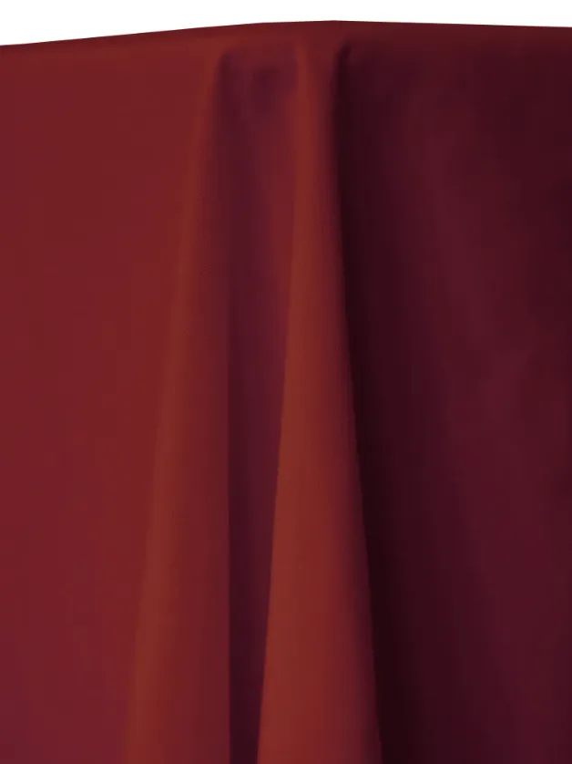
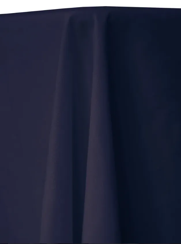
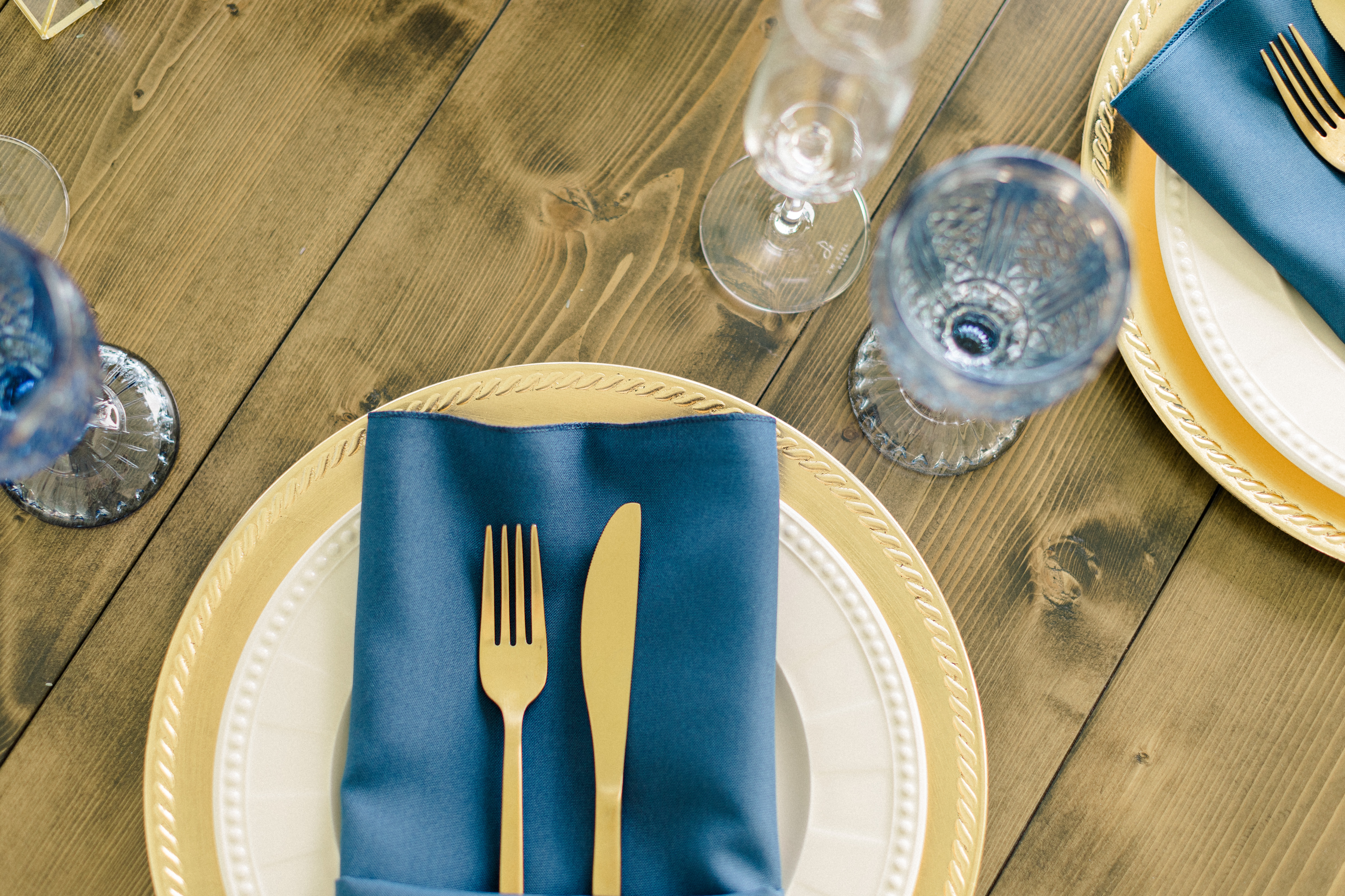
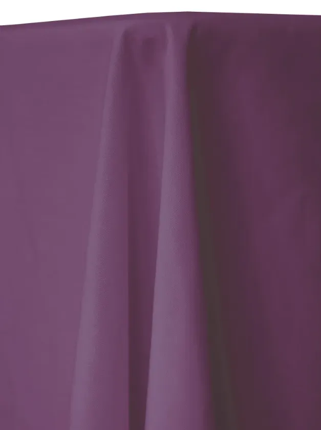
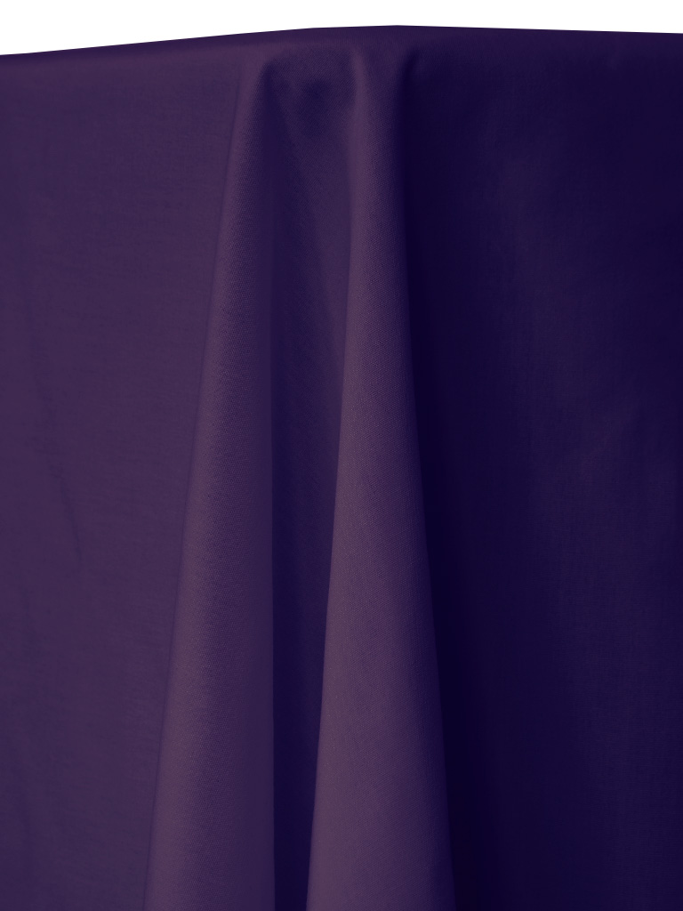
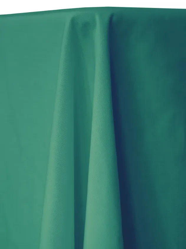
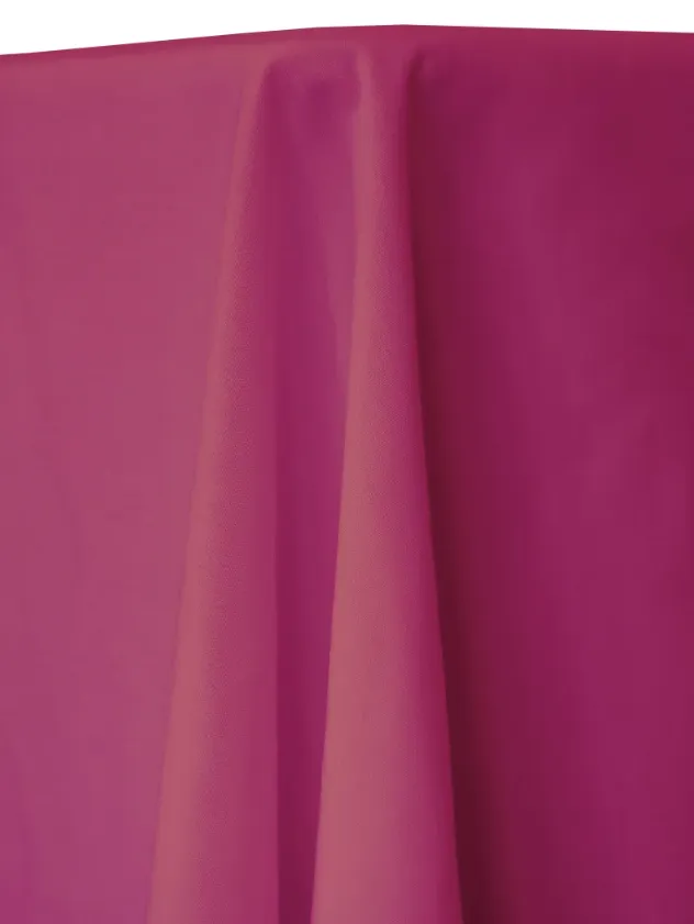
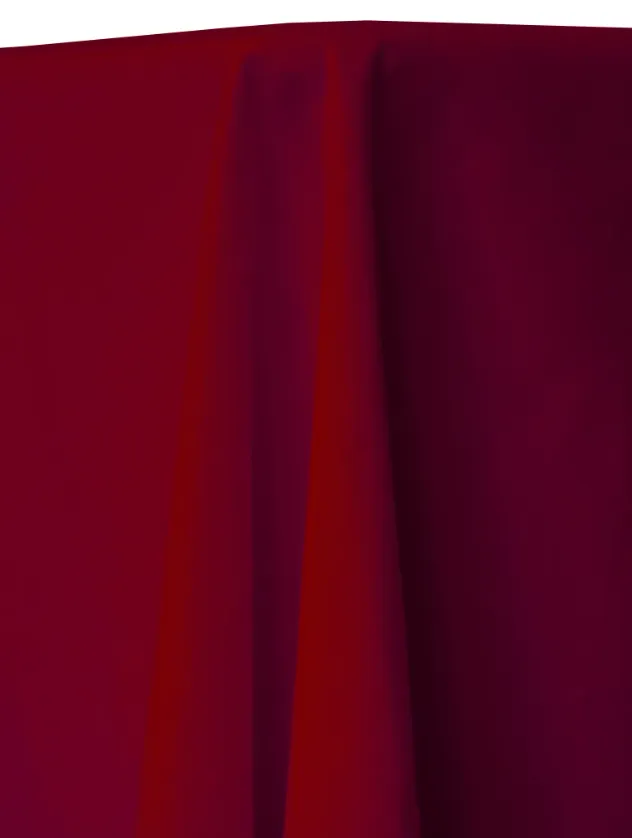
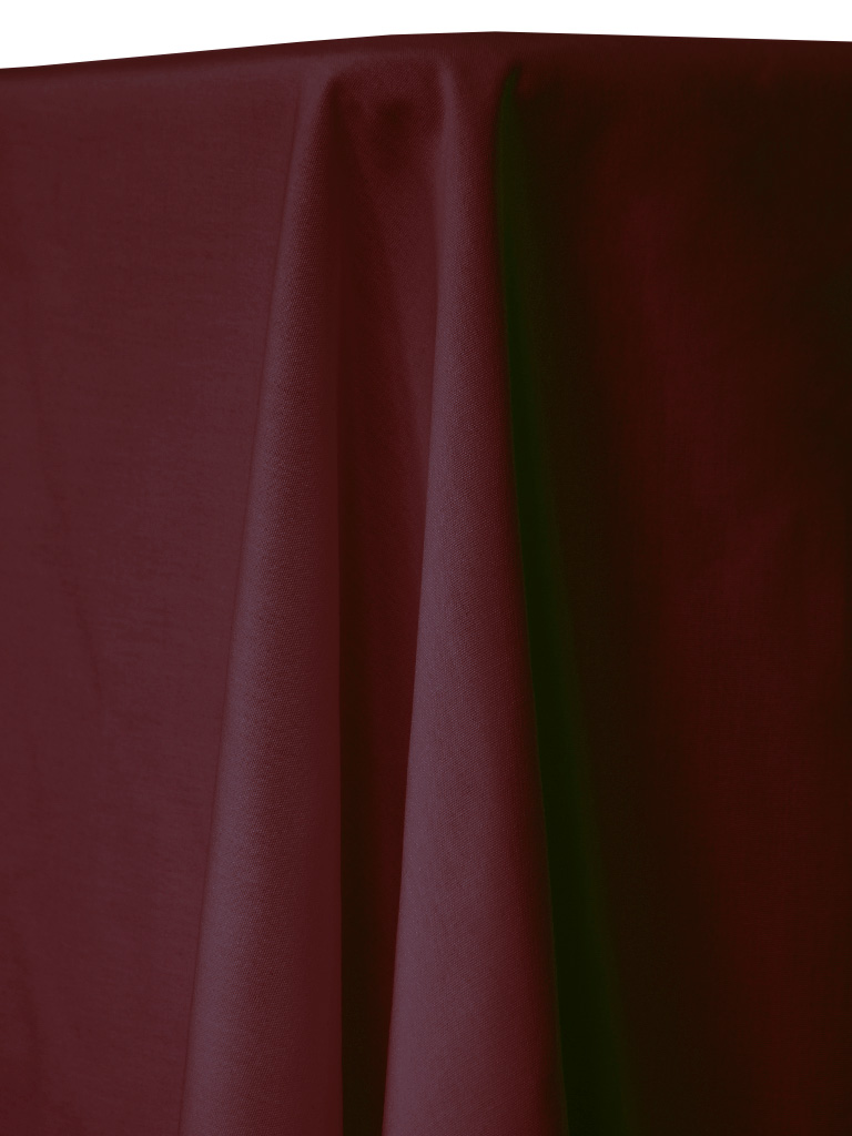
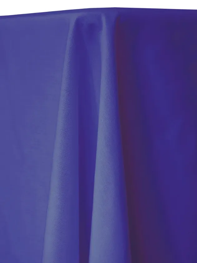
Deep Jewel Tones
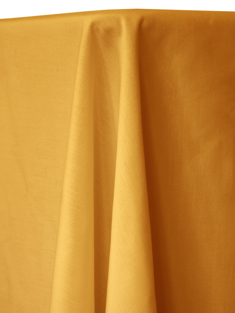
Strong Color Statements
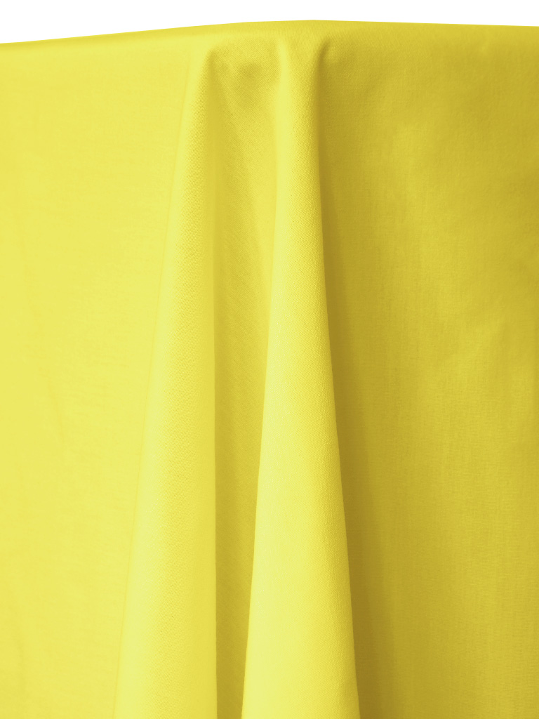
Bright Accents
How Color Behaves
Warm vs cool undertones: Some colors lean warm (soft, creamy, or golden), while others lean cool (crisper, bluer, or silvery). Choosing the right undertone helps linens coordinate naturally with surrounding finishes and décor rather than competing with them.
Natural light vs evening lighting: Natural daylight tends to show colors at their truest, while evening lighting can deepen tones and soften contrast. Candlelight and uplighting often make richer colors feel warmer and more dramatic.
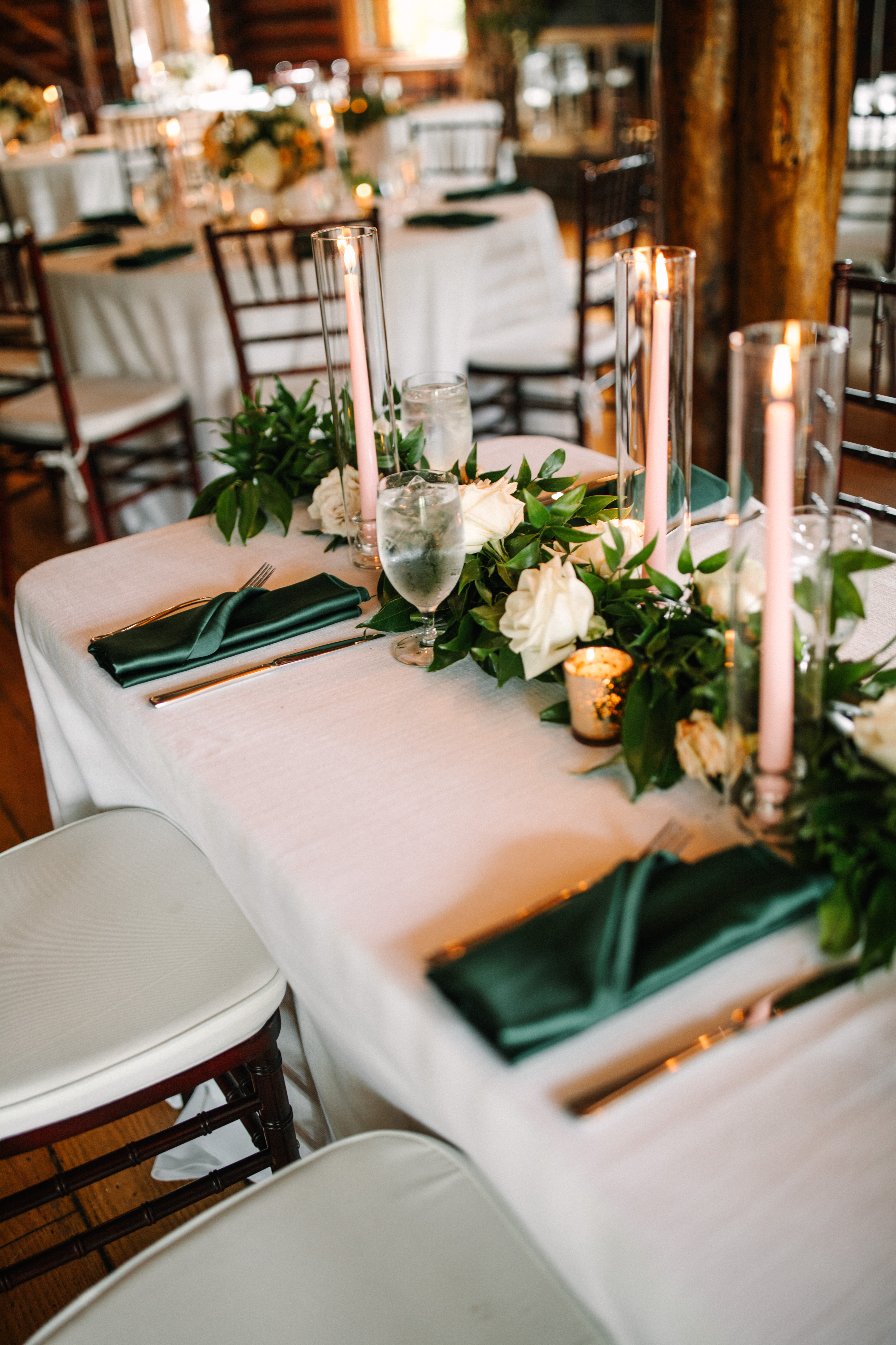
Wood floors vs white walls: Wood floors and warm materials can enhance earthy or warm-toned linens, while white walls and lighter spaces pair beautifully with crisp neutrals and cooler hues. The room itself plays a role in how color is perceived.
Photography considerations: Linens photograph best when they complement the space and lighting. Very bright whites appear crisp on camera, while softer tones can feel warmer and more romantic. Darker colors add depth but may show texture more prominently in close-up photos.
When in doubt, remember that lighting, space, and styling all work together—most colors look beautiful once they’re in the room.
Can I see color swatches before I book?
Absolutely. You can visit one of our showrooms to see the colors in person. This is best if you need to ensure color matching. Colors can vary from screen to screen and may look different in natural or event lighting.
Will linens match exactly to napkins?
Linens within the same color family coordinate well, though slight variations may occur due to fabric type and texture.
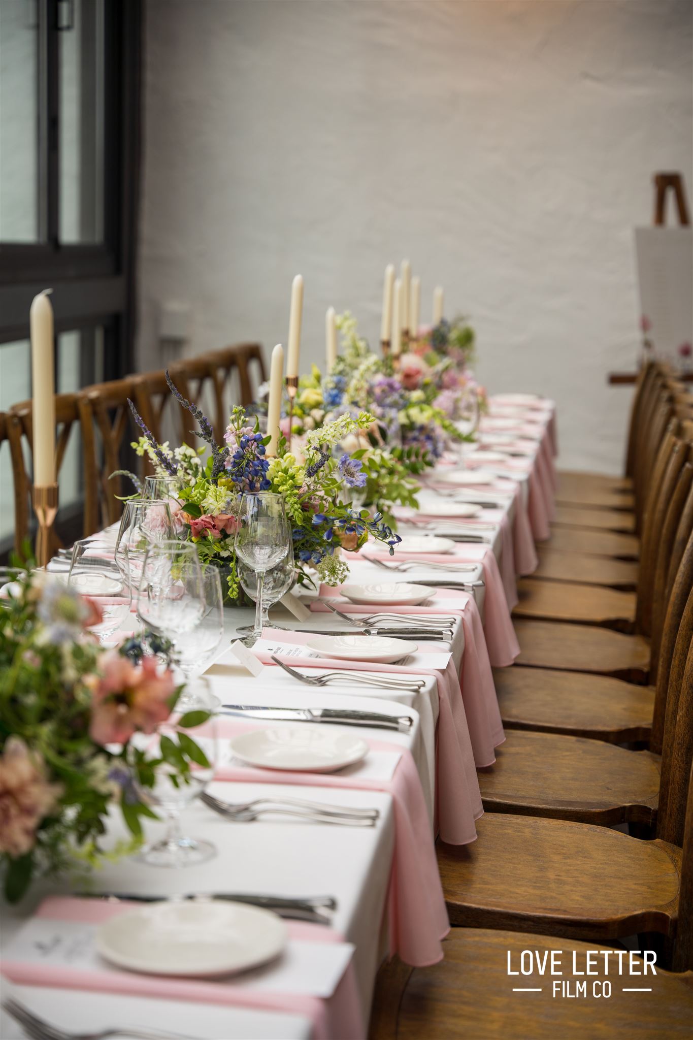
Can I combine different color moods in one event?
Yes. Many events use a neutral base with pops of color or mix soft tones with deeper accents for balance. Mixing colors is a great way to add depth and visual interest, especially for head tables, accent tables, or specialty areas.
Why do linen colors look different in photos than online?
Lighting, room color, and surrounding décor all affect how linens appear. Natural daylight, uplighting, and candlelight can subtly change tone and depth.
What are undertones, and why do they matter?
Undertones refer to whether a color leans warm or cool. Choosing the right undertone helps linens coordinate better with wood floors, walls, and other décor.
Are some colors better for evening events?
Darker and richer colors tend to feel more dramatic in evening lighting, while lighter colors feel fresh and airy during daytime events.
Do darker colors wrinkle more?
Wrinkles are not more common, but they may be more noticeable on darker colors. Proper table setup usually minimizes this.